ShopDreamUp AI ArtDreamUp

Deviation Actions


Suggested Deviants


Suggested Collections


You Might Like…


Featured in Groups


Description
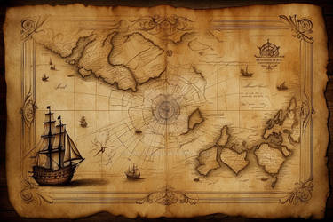
Medium: Ink (Copic Multiliners 0.1, 0.05), watercolour, coffee
Size: A2Finally done! This work was a commission for a friend, whose only direction was "your version of a world map". Initially I was planning a more abstract painting or drawing. But I really love ancient and medieval maps, the way they were so impossibly detailed and whimsical, often with huge sections of the world remaining mysteriously uncharted.
I did a lot of research, looking at what must have been hundreds of examples, all wildly different. I actually went to an exhibition of some of the world's greatest maps and was truly inspired there. What fascinated me most were the bizarre mythological creatures conveniently slotted into the unexplored waters, as well as the sometimes absurd surrounding detail and the "almost but not quite" shapes of the countries. They were generally pretty eccentric – much more interesting than our boring contemporary maps.
So I took all that away, and started thinking about mine. Because I could never just do a straightforward map, I decided to contextualize mine within a kind of hypothetical alternate history. I invented a language that seems to sit somewhere between Tolkien, Shaun Tan and astrological symbols. Unfortunately I don't have the skill to translate it. The idea was that this map was produced by an ancient extraterrestrial race with esoteric knowledge of the planets and stars. Perhaps they arrived on Earth travelling between dimensions, mapped what they saw and then left before they were able to finish.
I spent approximately 4 hours a day for a month on this map. I certainly didn't take the easy road and so it owned my life. But I'm really happy with how it turned out  (Smile)") Hopefully it translates on screen.
Hopefully it translates on screen.
~Simon
Follow my page on Facebook: facebook.com/simanion
Instagram @ simanion
Instagram @ simanion
Image size
2400x1653px 5.6 MB
© 2014 - 2024 Simanion
Comments131
Join the community to add your comment. Already a deviant? Log In
As someone who enjoys drawing maps, I have some ideas about this I'd like to share.
I really like the overall look and feel. I feel kind of like a student critiquing the work of the master, but I can't do anything abut that. Execution is very well done, with plenty of detail, and I plan to spend some time really looking closely at all those strange characters on the borders.
Most of the critical points I have are just artistic differences, so feel free to take them or leave them. From an execution standpoint I would like to point out a couple things. First, though the image is listed as "Traditional" it actually appears to be digital, especially around the edges with the wood pattern. I don't know if this is a misunderstanding on the part of the artist, or if my eyes are mistaken, or perhaps it's a traditional piece augmented with digital work.
Also, though I really like the unfinished and somewhat incorrect versions of the continents, I think the breaks in the outlines seem abrupt in some places. The outline of New Zealand in the lower left side looks like it was cut out. Perhaps a more gradual fading would look more appropriate.
Finally, I think one of the most fascinating parts of maps is the actual text or labels. With this mystical alphabet, I feel like it actually takes away from the enjoyment and mystery, and makes the map into a piece of fantasy art. While this may have been the artists intent, and this is simply a matter of opinion, I think it would have been more interesting to see the names of places. Perhaps having an unusual font, or strange spellings would have served better.
Overall, really great concept and execution!