ShopDreamUp AI ArtDreamUp
Deviation Actions


Description
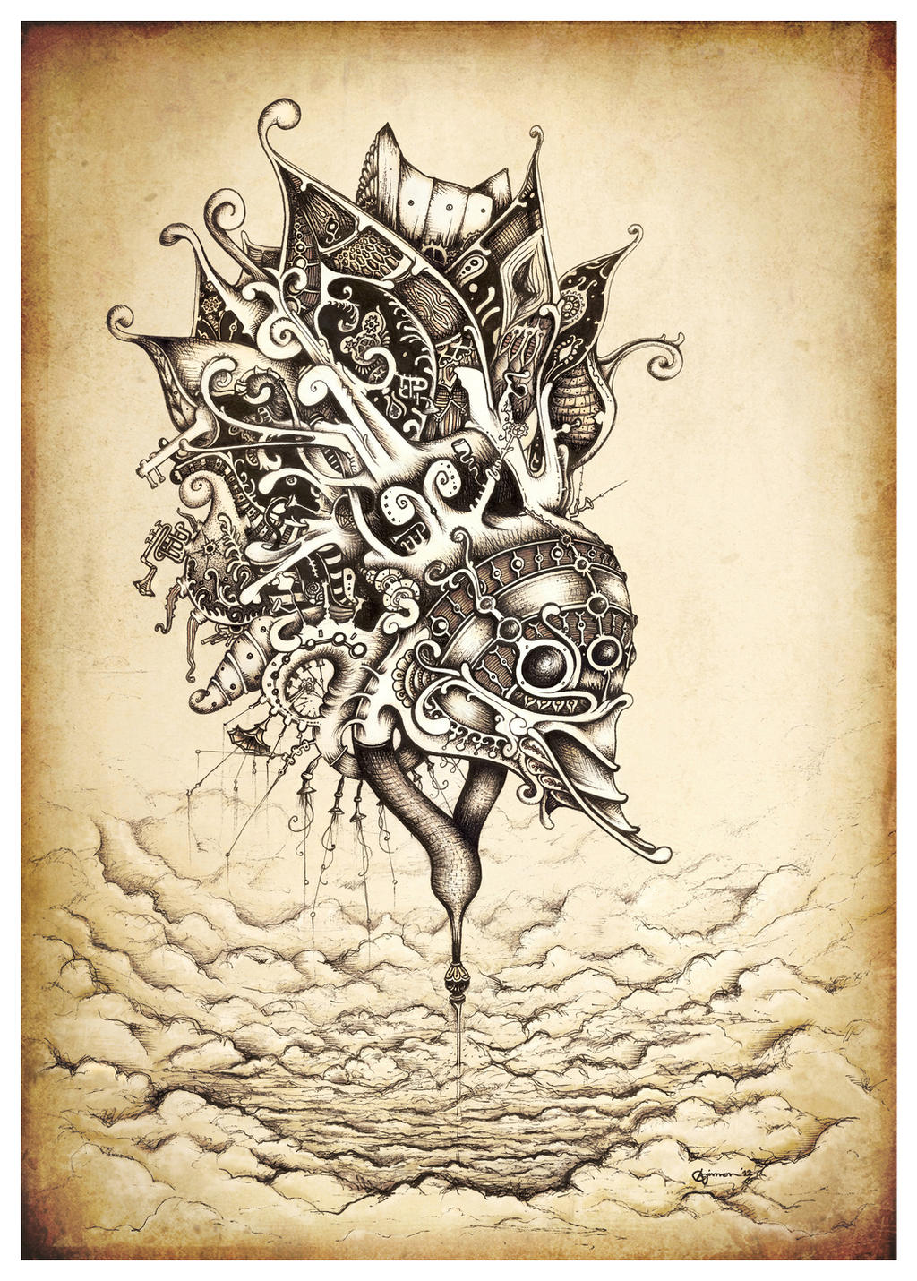
This drawing spent a long while as a few shapes and swirls, until I eventually turned it around and realised it was obviously an enormous, mechanical, possibly sentient air station with a duck head, way up in the sky. Duh. ......k.
Pretty much the whole time I was drawing, my pens were dead. Or on the verge of complete drying surrender. This meant I had to work my tiniest pens to the bone, basically scratching the ink into the paper. This gave it quite a textured but smooth and "rusty" look, in contrast with previous drawings obsessed with clean linework. In the end I just couldn't finish it without buying some new pens and adding some balance, but I tried to leave as much of the dry pen texture as possible.
When I finally finished I turned digitally coloured bits and pieces and gave it a sepia/vintage makeover, playing with the heavy steampunk vibes that came through in the drawing. Whilst it has been a bit of a fleeting influence, this is probably one of the more overtly steampunk things I've done.
I'm pretty happy with the way this turned out in the end (and with the original b/w pen drawing alone too), and it was good to try out (albeit out of necessity) a slightly different inking technique.
Hope you like it too")
~Simon
Follow me on Facebook for a more compelling and rich Simanion experience: www.facebook.com/simanion
Share "Duck Station" on Facebook: www.facebook.com/photo.php?fbi…
Reblog "Duck Station" on Tumblr: simanion.tumblr.com/post/32107…
Pretty much the whole time I was drawing, my pens were dead. Or on the verge of complete drying surrender. This meant I had to work my tiniest pens to the bone, basically scratching the ink into the paper. This gave it quite a textured but smooth and "rusty" look, in contrast with previous drawings obsessed with clean linework. In the end I just couldn't finish it without buying some new pens and adding some balance, but I tried to leave as much of the dry pen texture as possible.
When I finally finished I turned digitally coloured bits and pieces and gave it a sepia/vintage makeover, playing with the heavy steampunk vibes that came through in the drawing. Whilst it has been a bit of a fleeting influence, this is probably one of the more overtly steampunk things I've done.
I'm pretty happy with the way this turned out in the end (and with the original b/w pen drawing alone too), and it was good to try out (albeit out of necessity) a slightly different inking technique.
Hope you like it too
~Simon
Follow me on Facebook for a more compelling and rich Simanion experience: www.facebook.com/simanion
Share "Duck Station" on Facebook: www.facebook.com/photo.php?fbi…
Reblog "Duck Station" on Tumblr: simanion.tumblr.com/post/32107…
Image size
2598x3626px 7.56 MB
© 2012 - 2024 Simanion
Comments147
Join the community to add your comment. Already a deviant? Log In
Amazing pen work. I have also found pens and markers that start to run dry can usually serve an interesting purpose as far the the texture they give. I'm also glad you didn't over do it with the amount of digital work layered on top of the piece. The amount of detail is quite nice and not to overpowering having a natural flow that gives even the hard surfaced objects a soft organic feel.
As far as faults there are just a few minor things. I feel like the tower crates a strong downward pointing arrow. This along with the duck bill point to the right corner draws our eye towards the bottom of the page and we don't have anything that pulls our eye back to the main focus so that we can soak in those nice details you have so carefully placed. I also feel the placement of the tower needs to be justified slightly more to the right. The complex shapes and their distance to canvas edge on the left is creating uneasy negative space.
Otherwise this is an amazing piece and I hope to see more of you pen work.